 You may have noticed several changes here at JEBCommerce over the last several months. In March we released our new brand and our new website at JEBCommerce.com. Deploying a new logo and complete re-branding, as well as our new website, was quite the task. But I really enjoyed the entire process and our site has been well received. Once it was out there we really felt it was a generational leap and more represents the company correctly. Thank you to Russell Heistuman from Whitestone Design Werks for his amazing work. Shortly thereafter, all our clients’ affiliate newsletters received a complete make-over. Our goal with our newsletter make-over was to provide more useful information to affiliates, provide this information more efficiently and to ensure a higher rate of deliverability.
Our entire team thoroughly reviewed our internal newsletters as well as newsletters from some of the top programs in the world. Through that analysis, we came up with the new template that we are using for each of our clients to this day.
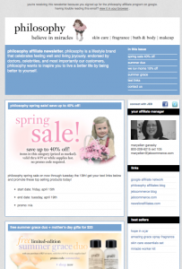
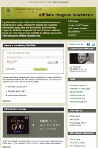
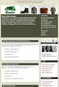
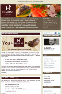
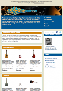
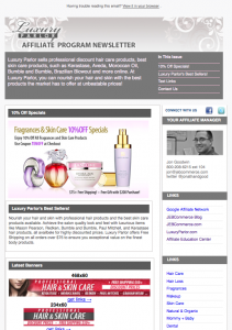
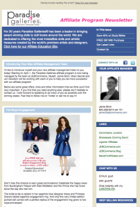
You’ll notice sections in each newsletter such as:
- Your entire affiliate management team
- Complete contact information
- Top products
- New text links
- New Banners
- Featured Products
- Affiliate Promotions
- Consumer Promotions
- Link to view the newsletter online
Check a few of our new newsletter templates below:
We are constantly evaluating our products, services, processes and all the items we deliver to affiliates and for our clients. We call it the Affiliate Continuous Improvement Circle. This process that governs all we do at JEBCommerce, led to the newsletters below. But we also rely on all our affiliates to let us know what they want and need. So if you have any feedback, please don’t hold back. We want to be the best in every category and are always open to constructive criticism. So far, these newsletters are showing higher open rates, and all our programs are seeing higher sales!

